

Strategic Identity for
Nonprofit Acceleration
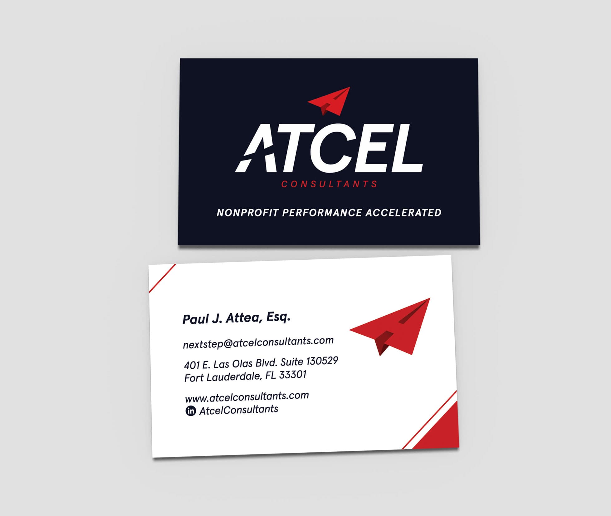
The branding for Atcel - Nonprofit Performance Accelerated effectively conveys the organizations' mission through a modern, dynamic, and strategic visual identity. The bold, italicized typography suggests speed and forward momentum, aligning with Atcel's goal of accelerating nonprofit performance. The red paper airplane logo, incorporating an "A" within its structure, symbolizes innovation, direction, and progress. This design choice reinforces Atcel's role in guiding nonprofits toward sustainable growth and leadership in their sectors. The deep navy background creates a strong contrast, enhancing readability and professionalism while allowing the red elements to stand out as a focal point.
Winning the GSDUSA 2023 American Graphic Design Award in the Visual Identity category underscores the branding's effectiveness, and strategic impact. The design aligns seamlessly with Atcel's core services, such as organizational development, strategic planning, and meeting facilitation, by visually emphasizing acceleration, precision, and structure. The branding conveys reliability and expertise, ensuring that Atcel is perceived as a trusted partner for nonprofits looking to refine their leadership strategies, maximize mission impact, and drive sustainable progress.