Harbor: Crafting Impactful
Experiences with Fluid Precision
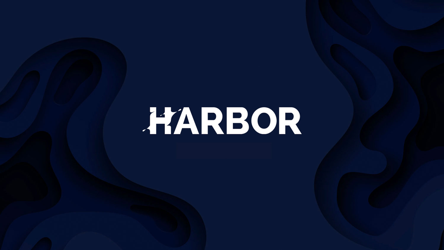
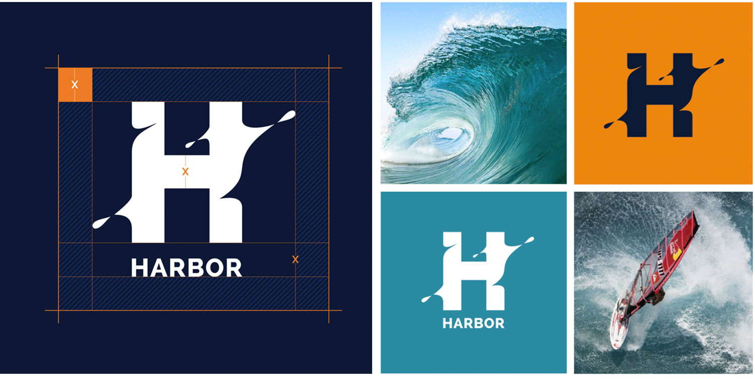
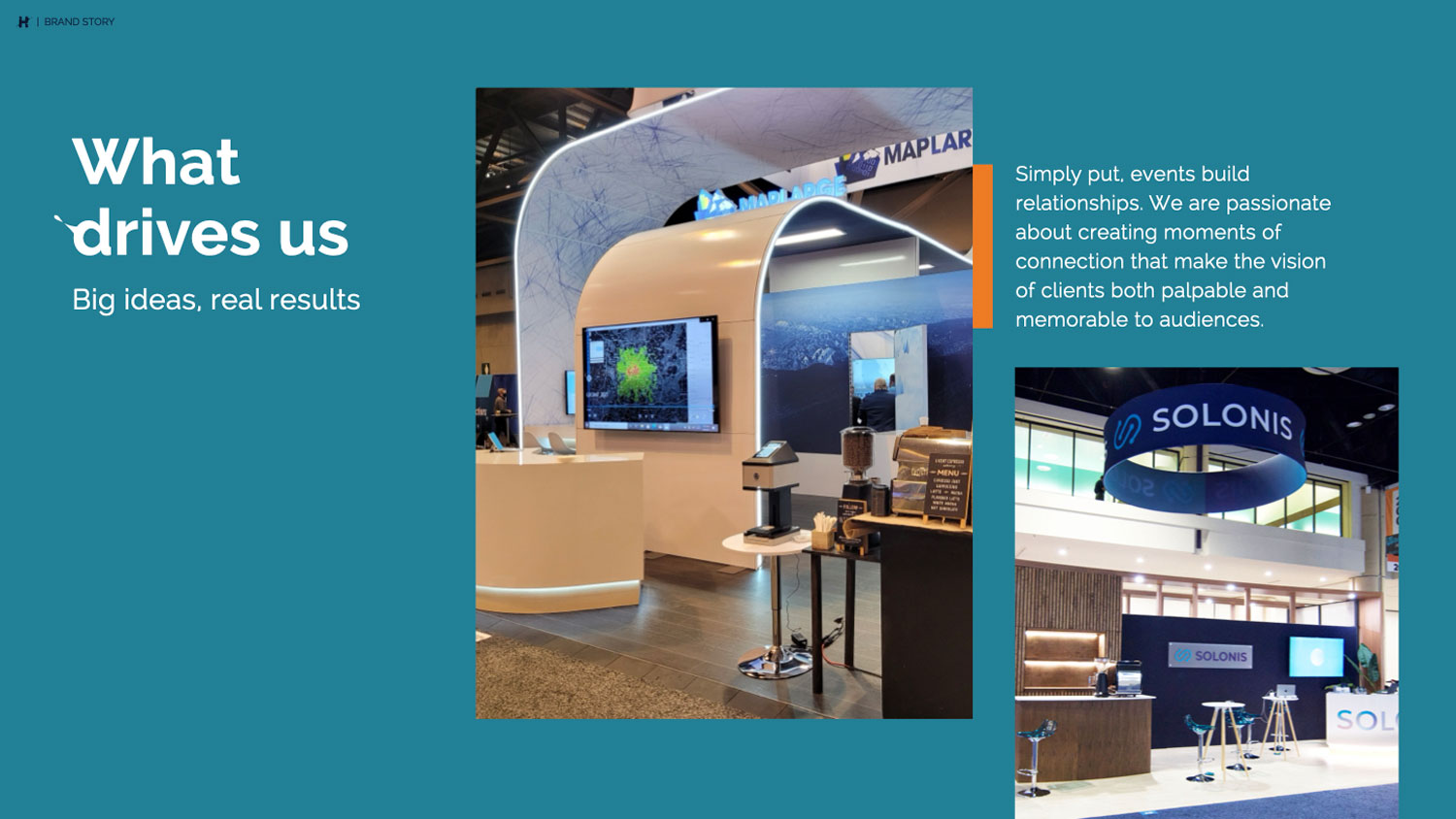
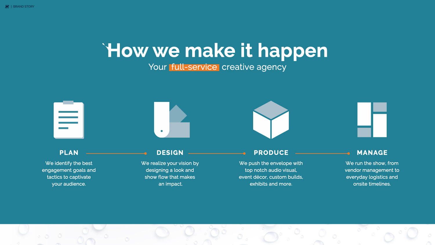
The Harbor rebrand beautifully captures the essence of the company's journey and aspirations. Rooted in a strong connection to water, the new logo reflects fluidity and adaptability, core qualities that Harbor embodies as a top-tier experience agency. With a strong emphasis on storytelling, creativity, and technical expertise, Harbor's branding effectively communicates its role as a reliable partner that transforms ideas into tangible, impactful moments.
The maritime-inspired colors and textures bring a sense of movement and depth. A vibrant color palette, including shades of blue, teal, and orange, represent the theme implied by the name Harbor and convey trust, creativity, and passion. The grid system and careful typographic choices reflect precision and professionalism, reinforcing Harbor's commitment to flawless execution and integrated planning.


